Category Archives: Design Process

On the Value of Design: 10 lessons. 7: Action – Reaction

Beaux arts-modernism-post-modernism- minimalism-graphicism (as this is how I see the latest trend to add graphics in interiors and on exteriors.) “For every action there is an equal and opposite reaction” is Newton’s third law of motion and seems to work equally well for the waves of which design moves. Monetary value for the designer thus is in being able to surf these waves, like Philip Johnson did during his long career. (According to Johnson architects are high-class whores.)

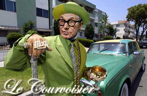
Others seem to have to be patient like the self proclaimed “architect of the American dream” Morris Lapidus, who in the 50’s and 60’s designed hotels that were described as “the nation’s grossest national product”, “superschlock” or “pornography of architecture”. Despite the flaming words of the critics Lapidus had many large commissions, mainly hotels. Like Johnson, Lapidus lived long, he died in 2001 at the age of 98. In the final years of his life, during the post-modern period, his eclectic buildings started to get a lot of attention, finally Lapidus’s momentum came. A lesson in the value of design: Morris Lapidus made a fortune designing hotels for the glamorous, but he seemed to long for peer recognition for which he had to wait very long indeed.
arch-PJ-le-courvoisier.jpg

On the Value of Design: 10 lessons. 6: Experience

Jeffrey Kipnis asked in “In the Manor of Nietzsche” why architects felt excluded from the stage of history when they had the opportunity to design the stage itself.
I believe that the emphasis on the sentence above should be on the opportunity that lies within architecture to be able, through its built form, to formulate a programme to create a setting for unlimited experiences.

I have earlier identified in a book called eBusiness and Workplace Redesign that the creation of spaces has gone through three distinct phases, each changing the hierarchical process that forms the creation of these spaces. First there are Sequential Spaces, these spaces are deeply imbedded in their context, the construction and the activities that take place within this space are all dependent on the dominant factor of the context. An example of a Sequential Space are Igloo’s; the context provides the only source for construction namely snow and ice. The activities are very much limited by the sequential character of the context. Next, are Parallel Spaces, their main objective has been to free construction from the limitations of the context. In Parallel Spaces, construction becomes the main element in order to be able to build anything anywhere in exact the same way. Examples of Parallel Spaces are the glazed, boxed Central Business Centres one can find in any city in the world. The third space are Transitional Spaces where we see a shift towards the emphasis on the activities, as construction and context are become one. The characteristics of Transitional Spaces is that they are interior orientated, operate 24 hours (or whatever time they feel appropriate) and have secure access control. Think of Disneyland, casinos or shopping malls, the construction creates its own context and the emphasis is on the activities that are taking place inside.

Venturi and Scott Brown have written about the architectural implementations of transitional space in “Learning from Las Vegas.” Joseph Pine and James Gilmore focus on the activities when they write in “The experience economy” that –ing is the thing: within the Transitional Spaces “work is theatre and every business [is] stage”. The emphasis is on what is happening inside these spaces, the activities that are taking place within. The well-know marketing concept such as Third Place has been coined by Ray Oldenburg. A Third Place is a location between home and work (first and second places according to Oldenburg) where people can relax in good company. Austrian guru and trend scout Christian Mikunda has written a book of recipes for “New Experience Worlds” and identifies in “Brand Lands, Hot Spots and Cool Spaces” that experience design should aim for spaces that become landmarks, emphasizing the circulation through the space, providing a leitmotif, or a strong concept that holds the place together and finally the design should aim to contain a magnetic attraction for visitors.
Examples in the book are Selfridges in Birmingham by Future Systems and Volkswagen Autostadt.
This should, I am convinced, not be limited to shopping, but be part of the experience in the workplace as well.

On the Value of Design: 10 lessons. 5: Form follows function

This has been quoted, used and abused so much that it has become wafer thin. (50 million results in Google.)
According to Wikipedia Louis Sullivan “borrowed” the quote from Horatio Greenough. Sullivan actually said: “Form ever follows function.” However, an Italian Jesuit monk Carlo Lodoli seemed to have laid the foundation for the Modernist credo in 1750 and Greenough while in Italy might have stumbled onto it.
Frank Lloyd Wright must have been in one of his many naughty moods when he proclaimed that: “Form follows function – that has been misunderstood. Form and function should be one, joined in a spiritual union. ”
Form follows function has, from Lodoli onwards, been a reaction against ornamentation, an attempt to express beauty in its purest and most simple, naked form. Adolf Loos wrote in 1906 an articel called “Ornament and Crime” in which he proclaimed that it was a waste of effort to add decoration to any product and that the decoration would soon be out of style. The machine aesthetics of the early 20th century dreamed of pure beauty freed from ornamentation. After all, Le Corbusier called decorative arts ‘the final spasm of a predictable death’, although when Le Corbusier talked about the beauty of mass manufactured goods, he wrongly used a hand-made Bugatti as an example of machine made aesthetics.
According to Reyner Banham Form follows function was an “empty jingle”, I could not agree more. It is not that I proclaim to abandon the credo, I think we should try to forget it. A scene in Fawlty Towers comes to my mind, Basil Fawlty is having car problems and decides to beat his car with a branch for letting him down. This is a scene from the late 70’s, when cheap cars such as the one Fawlty is driving had the tendancy to breakdown any moment. A Simca was said to start rusting in the show room.
Today, cars, even the cheapest ones start, anytime and they don’t rust. The technical functionality of the cars have been driven to such a perfection that we can forget about function and instead focus on design not as an expression of a function, but as an expression of an expression, self-expression. We buy cars, or any other products as a way of expressing ourselves. (more about this later).

On the Value of Design: 10 lessons. 4: I have a dream

You can read them on most corporate websites: the mission statements, core values etc…Nothing wrong with it, very important actually, only most of them are meaningless words if you ask me. The funny thing is that most of the core values seem to be an exercise in making the same statements as everyone else. Here are a few:

“We are an IT service provider providing value added business solutions at a world class level to our customers.”

I googled the above statement and got 6,430,000 sites with the exact words.

Here is another:
“Our vision is to be recognized as a leader in providing IT services.
To be a leader we must aim for:
– our customers to see us as the most trusted company.
– our employees to see us as the most desired place to work.
– our shareholders to see us their most valued company.
– to be seen as helping build a better community.”

And yet another:

“We aim to be a global organization that constantly stays a step ahead in dealing with change, creates new value, and contributes broadly to society.”

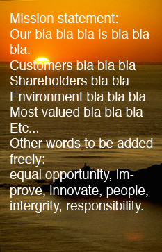
Don’t get me wrong, I understand that in order to get it, that you need to know what you want. Formulating your mission and core values are the first step, but is the next step limited to pasting these words on a website, or laminating them over a sunset and hanging them in a cafeteria or reception?
We never (ever!) had a client telling as at a start-up meeting: this is our mission statement, let’s see how we can translate it into our work environment.
A great opportunity missed! As I have said many times to our clients: offices tell more than words! Enough said.
Sunset.jpg
PS. How about this advertisement slogan of a real estate company:
“We are unambiguously on the client’s side and we know the market.”
Mission, marketing statement? Somehow it make me think of ABBA

Chair dance

Having to wait twice for my transfer at Toronto’s airport for six hours each time, I noticed a pattern of how rows of seats at lounges at the departure gates are being filled up. Seats are arranged parallel to the window in groups of eight seats with a small table attached in between 4 seats. I was one of the first to arrive and went to sit close to the window. More people came and picked seats either at the far end of the seat row or like me, at the window. Once most of these seats were taken people took the seats in between, making sure to keep a distance of two to three seats open. If possible people avoided sitting directly in front of each other, making sure they sit diagonal from each other. The seats are arranged in sucha way that people are not facing each other anayway. The last open seats would then be picked up by those arriving last.
Interestingly, as I had 6 hours to kill I tried, as an experiment I went to sit at lounges where few people were sitting, and the same pattern occurred every time.

A perfect example of the Prospect Refuge law.

On the Value of Design: 10 lessons. 3: Invisibility

Design should in the end become invisible, it should become unconscious, forgotten. A chair that constantly reminding you of its presence is a chair that has a functional disorder. A building that makes the inhabitants curse of the architect on a dialy basis (I am living in one) is like the houses in one of Ballard‘s short stories The Thousand Dreams of Stellavista. I am living with someone I was not intended to have around me at all: the annoying presence of another architect. The difficulty here is that designers, architects are trained to be highly self-conscious and more often than not, they (uhh…ok I mean we) complain about bad clients. Or better: clients who don’t seem to understand what the design is about. Jorge Louis Borges once said: “it is more difficult to find good readers than it is to find good writers.” To paraphrase Borges: most architects design the buildings they intent build with a perfect occupant in mind: ie a monk.

On the Value of Design: 10 lessons. 2:Beauty

As Philip Johnson has made it clear to us students of architecture: beauty is subjective, what is beautiful to one is pretty ugly to someone else, de gustibus est disputandum. True words from someone who called architects high class whores. According to the ancient Greek, the world is divided into chaos or “that which has not taken form yet”, versus cosmos: “the world perceived as a beautiful well-balanced jewel”. As if god-the-architect had unrealised plans. This is what Alberti thought of this principal:

“Beauty is that reasoned harmony of all the parts within a body, so that nothing may be added, taken away, or altered, but for the worse. It is a great and holy matter; all our resources of skill and ingenuity will be taxed in achieving it; and rarely is it granted, even to nature herself, to produce anything that is entirely complete and perfect in every respect.”

The Japanese architect Arata Isozaki had an original approach towards beauty in designing one of his first building’s: the Fukuoka bank building. As a young architect, he wanted to make sure that everyone perceived his building as ugly. Come to think of it, it is a rather clever approach of Isozaki using ugliness as a crutch and avoiding any misconceptions on the discussion of the building. This makes you wonder how ugly can a design become? The question obviously is as difficult as its opposite.

On the Value of Design: 10 lessons. 1:KITSCH

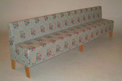
Here is Wikipedia’s view of Broch on Kitsch: “While art was creative, Broch held that kitsch depended solely on plundering creative art by adopting formulas that seek to imitate it, limiting itself to conventions and demanding a totalitarianism of those recognizable conventions. To him, kitsch was not the same as bad art; it formed a system of its own. He argued that kitsch involved trying to achieve “beauty” instead of “truth” and that any attempt to make something beautiful would lead to kitsch. “ The question obviously becomes who borrows what? What is original anyway? Plato said that we learn anything new, we just remember what we have forgotten. Isn’t a creative process just that: tapping into our unconscious mind, like we do at night when we dream, creating random images of which we somehow try to recreate some coherence that might work? Some of the work of many of the contemporary Dutch design such as Marcel Wanders and Moooi are trying to achieve: re-shaping the kitschy 70’s products and furniture we remember our grandmothers had (or still have) but in such a way that it fits in a temporary interior, a kind of post-post modernism. We all love kitsch now.c-530-03.jpg

Sofa: Jufferbankje by Piet Hein Eek.

Useless design?

“NASA spent 8 years and billions developing a pen that could write in space. It needed to be able to work in zero gravity, at a range of temperatures, and be able to write on any surface. The Russians used a pencil.”

It seems that the pen took only 2 years and 2 million to develop, but it is a great story that is true for many products.

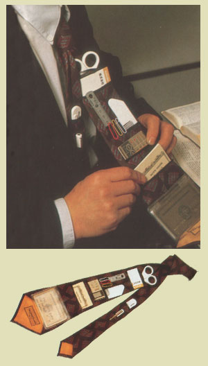
This reminds me of term for useless inventions coined by Kenji Kawakami: chindogu, more here and here. Some of these inventions are hilariously funny, however, I suspect that car companies stumbled accros the the Softdrink Holder and thought it wasn’t such a useless idea after all.
invnts5.jpg

Portable office tie.

The wrong slippers

Like Borges once wrote that good readers are as difficult to find as black swans, architects must feel the same about the people occupying there buildings. There is a classic example of the Belgian Art Noveau architect Henry van de Velde whose design aspired for a “total” piece of art. The Germans have a word for it: Gesamtkunstwerk.
van de Velde, an artist by training, would design absolutely everything in his houses. He went to great pains to make sure nothing, absolutely nothing, not even a spoon or a fork would displease the eye. Art after all was serious, sacred as he had written in “voie sacree” in1894. For his own house, built in 1895 he went as far as to design the dresses of his wife Maria Sethe. This was architecture and life inside celebrated as a magnificant, all encompasing, total piece of art.

After one of van de Velde’s houses was finished, his client invited him to the new house for dinner. Upon arrival van de Velde gave his client a frowning look. “What was wrong? ” asked the client, who during the course of the design process of the house had become very aware of van de Velde’s allergic reactions against anything not-artistic. “Look”, the client would proclaim, “I am even wearing the slippers you designed.”

“I can see that!” van de Velde yelled, “but these are the slippers for the bedroom. Can’t you see they are competely out of place here?!”